Getting a publishing business started on a shoestring is a challenge. Being so busy with writing, I gave only passing thought to the mechanics of getting a book from the word processor to the distribution channel—and just because it was an eBook did not make it easy as pie.
I recall recently reading a crowd source request by an author who wanted to commission an artist to create cover art for a book.
Though my company, Pingv, is a graphic design shop, I was on a budget, and given my budget, I could not allocate our talent pool for this project. Hence I had to go open source. Fortunately, for my genre, Japanese samurai fiction, there is actually a good deal of readily available open source material, or at least artwork that due to its is now public domain.
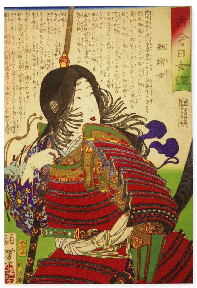
Japanese woodblock prints go back at least 300 years. They capture the lives of famous people, historic events, or stories and myth, in the manner of modern manga, at least in spirit. Many of these colorful prints depict samurai, and some even chronicle female samurai.
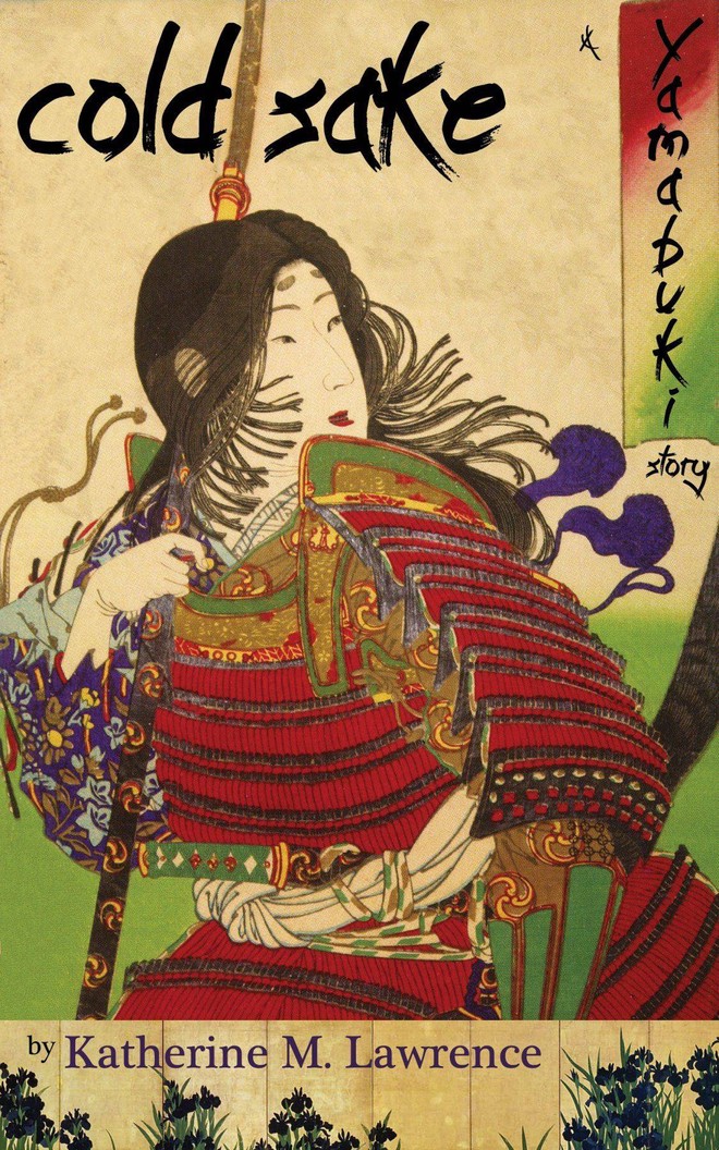
The main character of my book, Cold Saké, is Yamabuki, who is said to have actually lived, and can be found as the subject of woodblock prints that are now public domain. The woodblock prints do depict her, although more often than not, in situations where she is upstaged by her fellow warrior, Tomoe Gozen.
Tomoe Gozen has ignited the imagination of the audience that likes to see competent women who live the lives of warriors. Since so much was written about Tomoe, and conversely much less about Yamabuki, I felt that basing my character on the less well-known Yamabuki would make my creative work more interesting.
At this point, I felt that so long as the cover got the idea across that the book was about a woman samurai, that was all that could be expected of a print that was open source.
After some searching, I found an excellent work by Tsukioka Yoshitoshi, circa 1880, which depicts warrior Tomoe Gozen in rich red battle gear. Never mind the three-comma, pin-wheel, mon, clan crest that Tomoe invariably sports. In fact, the name Tomoe calls to mind exactly that pattern.
My editor, Laura Lis Scott, did some moonlighting, and in command of InDesign, Illustrator, and Photoshop, she removed the Japanese text from the print, and put together a cover that we thought would serve.
With the initial manuscript completed and moved into Scrivener, and a colorful cover, the manuscript was sent to some of the gracious people who volunteered to be proof readers.
Inevitably, they caught punctuation issues, a missing word here or that that comes from editing-in-the-can, as they say in film, and other things that the writers stop seeing, having stared at the same pages day on end.
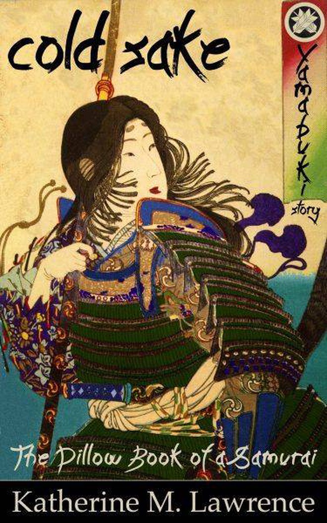
But to my surprise, it was the proposed cover that drew across-the-board feedback, and this sent us back to Creative Suite for another round of design.
Without really realizing it, I had made a big deal out of Yamabuki’s costume—her armor in particular—so, the readers asked, how was it that her armor is red on the cover, when the text unequivocally stated her armor is dark-jade green with cobalt blue cords, and what about the crossed-feather insignia of the Takagi clan? Where was that? Those reading upcoming manuscripts know that her kindred had come up from fletchers, so there was a story behind the family crest.
After reviewing what we could and could not do to a historic print, we set out to make the adjustments suggested by the proofreading team.
Then Laura started the delicate process in Photoshop to modify the hues, saturation, and brightness of the then existent cover.
As before, with a limited budget, time was not on our side, so Laura worked among layers that ended up being additive, meaning that some of our choices would be effected by previous modifications to other layers. Had we had but world enough and time, we could have made this even crisper, but in was 90-percent of the way there and wanting to launch this over the Christmas break, when we had some time away from work, we went forward.
The twin arrow feathers were found in public domain file. After some trial and error, the emblem was simplified and ultimately added to the banner, where it would have been found in historic times, albeit later than Yamabuki’s, but some artistic license was called into play, and we agreed it looked good where we placed it.
We then addressed the Tomoe symbol, the clan crest of three-commas. After some analysis of the layers and having to distort the flat pattern of the crossed-feather mon into three dimensions—for example, wrapping around the naginata shaft—we agreed to leave the originals in place.
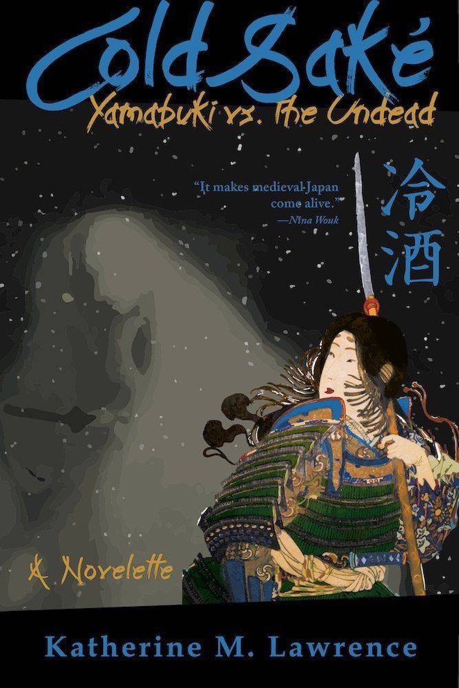
Already working on the next cover for the next book.